Color Grade Transfer from Photo
Last updated
Upload your photo + a color reference, and AI matches the exact palette and mood.


Upload photo to transfer color grade
"match the color grading from the reference image, applying the same warm white balance, skin tone rendering, and soft shadow detail to this photo"
Drag & drop, or paste · JPG · PNG · WEBP
Release to upload
How it works
-
1
Upload your photo
Drop the photo you want to color grade into EditThisPic. This is the destination — the image whose tones you want to change. JPG, PNG, or WebP up to 7MB. Any subject works: portraits, landscapes, product shots, street photography.
Expect: Simple palette transfers (similar subjects): 15-30 seconds. Complex mood matches with very different lighting: may need 2-3 refinements. -
2
Add your color reference image
Click '+ Add reference image' below the prompt box to upload the photo whose color grade you want to copy. This is the source — the image with the tones, mood, and palette you love. It can be a film still, an Instagram photo, a wedding photo, or any image with the look you want to replicate.
Tip: The reference image doesn't need to have a similar subject. A landscape photo's tones can be applied to a portrait — the AI reads the palette and mood, not the content.Copy one of these to get started:
Color Grade Transfer fromtransfer the color grading from the reference image — make it look natural and professionalWedding photo color consistencymatch the color grading from the reference image, applying the same warm white balance, skin tone rendering, and soft shadow detail to this photoCinematic teal-orange grade transfertransfer the cinematic color grade from the reference image, matching the teal shadows, warm orange highlights, and high-contrast lookInstagram aesthetic matchingcopy the color palette and mood from the reference image to make this photo match the aesthetic — same warmth, saturation level, and overall feel3 more prompts
Selective shadow and highlight transfertransfer only the shadow tones and highlight warmth from the reference image, keeping the midtones and skin tones from the original photoVintage film look from referencecopy the faded, analog film color grade from the reference image — match the lifted blacks, slightly desaturated colors, and warm cast throughoutMatch colors for before/after contenttransfer the color grade from the reference image while preserving enough of the original tones that the before/after transformation is still clearly visible -
3
Describe the transfer
Type what you want: 'transfer the color grading and mood from the reference image' or 'match the tones, shadows, and highlights from the reference.' Be specific if you want partial matching: 'apply the warm highlights and teal shadows from the reference, keeping my sky natural.'
Tip: Name the characteristics you most want to match: 'copy the crushed blacks, warm highlights, and desaturated skin tones from the reference photo.'Copy one of these to get started:
Color Grade Transfer fromtransfer the color grading from the reference image — make it look natural and professionalWedding photo color consistencymatch the color grading from the reference image, applying the same warm white balance, skin tone rendering, and soft shadow detail to this photoCinematic teal-orange grade transfertransfer the cinematic color grade from the reference image, matching the teal shadows, warm orange highlights, and high-contrast lookInstagram aesthetic matchingcopy the color palette and mood from the reference image to make this photo match the aesthetic — same warmth, saturation level, and overall feel3 more prompts
Selective shadow and highlight transfertransfer only the shadow tones and highlight warmth from the reference image, keeping the midtones and skin tones from the original photoVintage film look from referencecopy the faded, analog film color grade from the reference image — match the lifted blacks, slightly desaturated colors, and warm cast throughoutMatch colors for before/after contenttransfer the color grade from the reference image while preserving enough of the original tones that the before/after transformation is still clearly visible -
4
Generate and review
Check that the transferred grade feels cohesive — shadows should carry the right tone, highlights should match, and the overall mood should feel consistent with the reference. View at 100% zoom to check that skin tones or key subjects still look natural.
See it in action
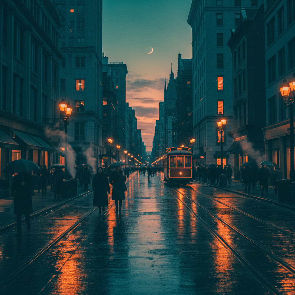

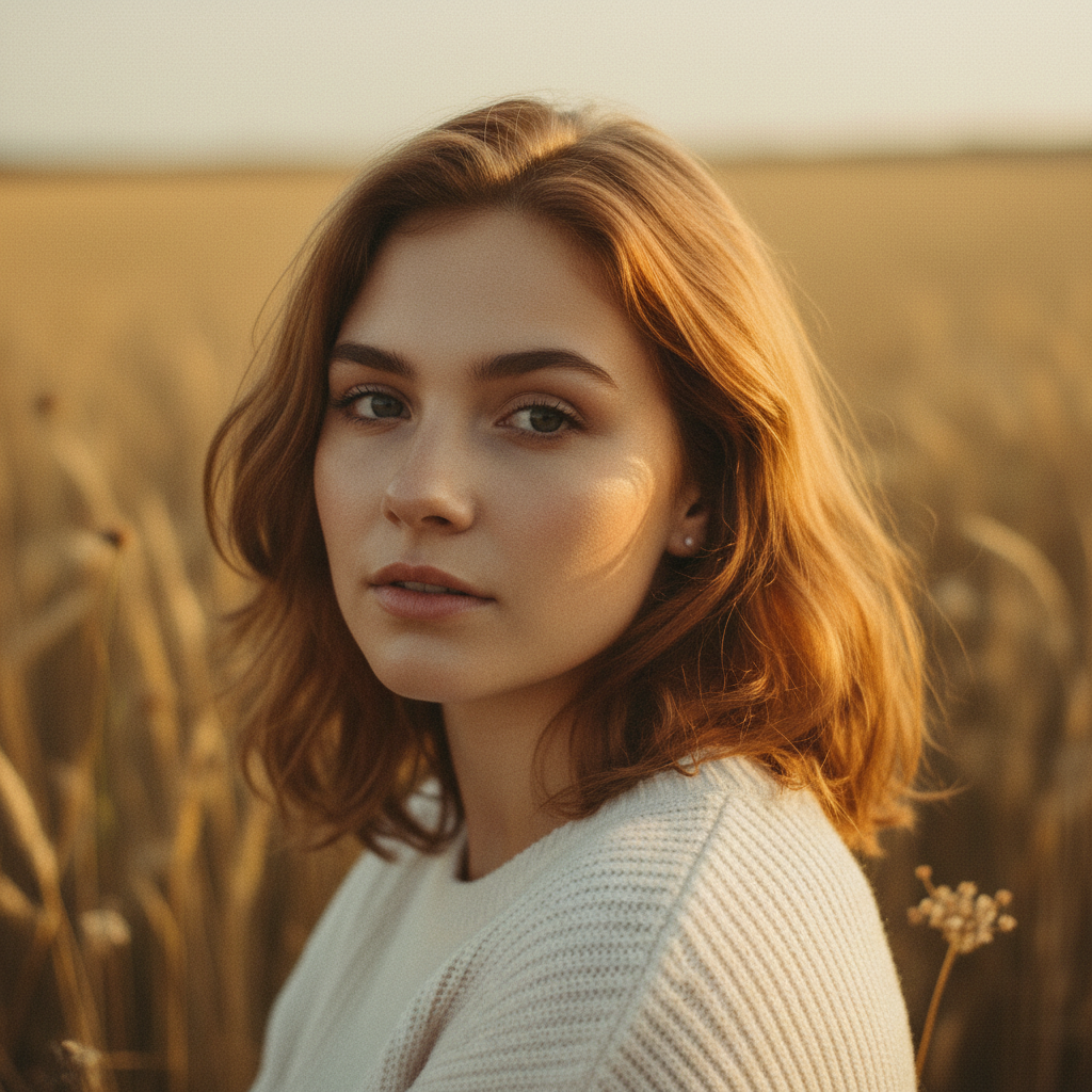
Flat portrait gets cinematic teal-orange grade
A correctly-exposed but flat, ungraded portrait is transformed using a cinematic film still as the color reference.
transfer the color grading from the reference image, matching the teal shadows, warm orange highlights, and cinematic contrast and mood
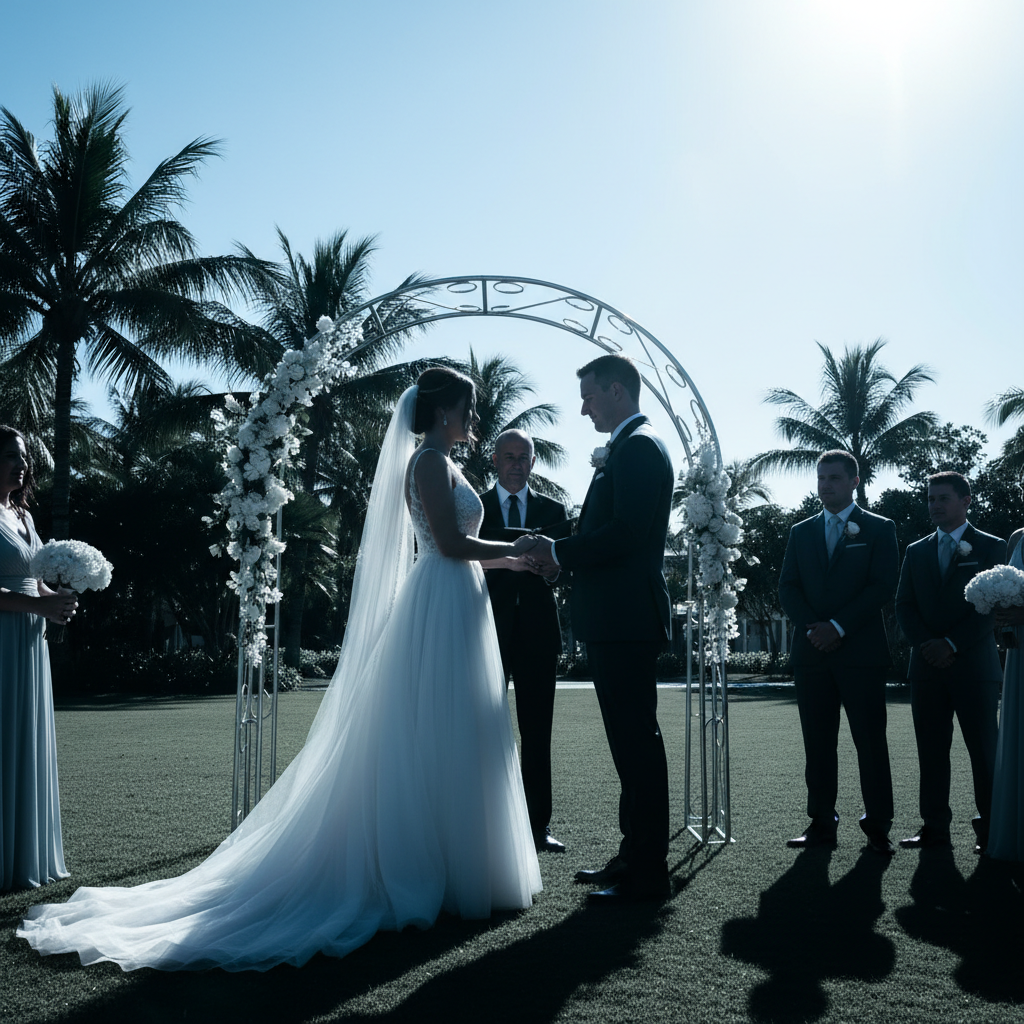
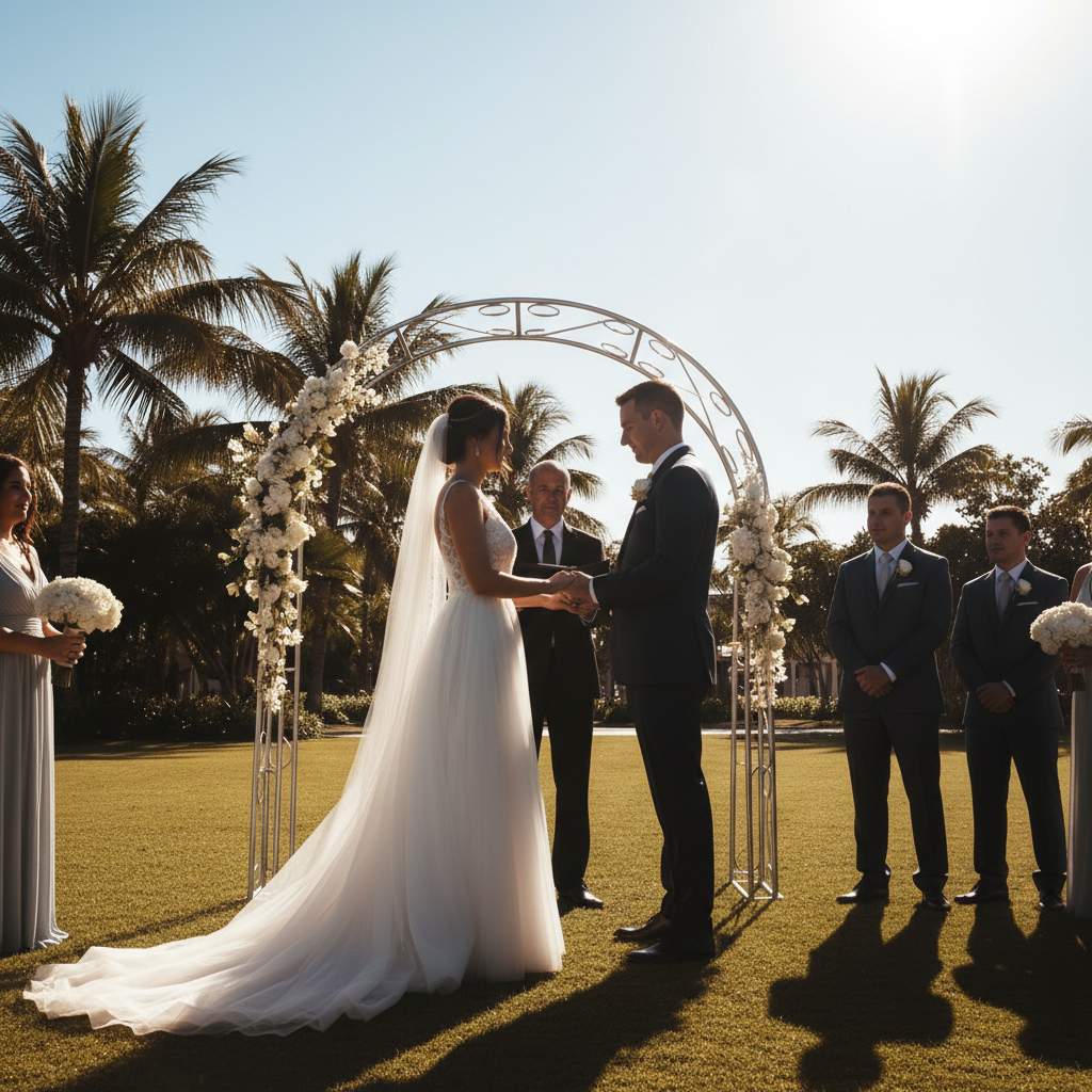
Wedding ceremony photo matched to reception edit
A bright, harsh outdoor ceremony photo is color-matched to a warm, soft indoor reception shot used as the reference.
match the color grading from the reference image — apply the same warm white balance, soft shadows, and skin tone rendering to this photo so it matches the rest of the set
Quick answers
Do I need to mark areas of my photo before transferring the color grade?
No. Just upload your photo, add the reference image via '+ Add reference image,' then type 'transfer the color grading from the reference image.' The AI reads the full palette and mood from the reference and applies it globally to your photo — no selection tools or area marking needed.
How do I transfer a color grade from one photo to another for free?
EditThisPic lets you transfer color grades between photos free with no account or signup. Upload your destination photo, click '+ Add reference image' to upload the photo whose color grade you want to copy, type 'transfer the color grading and mood from the reference image,' and hit edit. The result downloads without a watermark. One free edit per week, or purchase credits for more.
Can the reference image be a different subject than my photo?
Yes. The AI reads the color palette, tonal distribution, contrast, and mood from the reference — not the content. You can use a landscape photo's tones on a portrait, or a film still's grade on a food photo. The reference image just needs to clearly show the color style you want to replicate.
Is there a free tool to match color grading between photos without Lightroom?
Yes. EditThisPic matches color grading between photos using AI — no Lightroom, no Photoshop, no presets required. Instead of manually adjusting HSL sliders and tone curves, you just upload the photo whose grade you want to copy as a reference image, describe the transfer, and the AI handles the entire matching process. Free to try, no account needed.
How do I make all my photos the same color tone for a consistent feed?
Edit one photo until the color grade looks exactly how you want, then use that photo as the reference image for all your other photos. Upload each ungraded photo, add the edited one as the reference, and type 'match the color grading from the reference image.' This gives you consistent tones across your feed without creating or buying a preset.
Can I copy a color grade from an Instagram photo?
Yes. Save or screenshot the Instagram photo with the color style you want, upload it as your reference image, and type 'transfer the color palette and mood from the reference image.' The AI reads the aesthetic directly from the photo — warm tones, faded look, dark and moody, bright and airy — and applies it to your photo.
What's the best way to transfer a cinematic or film look from a movie still?
Use a clean still from the film — a frame where the color grade is clearly visible with good subject and background separation. Upload it as your reference, then describe the specific characteristics: 'transfer the teal shadows, warm orange highlights, and cinematic contrast from the reference image.' Being specific about the grade components (shadow color, highlight warmth, contrast level) produces better results than a generic transfer instruction.
Will the color transfer work if my photo and the reference have very different lighting?
Yes, though large lighting differences (indoor vs. outdoor, day vs. night) may require a more detailed prompt. Describe what you want to carry over: 'match the warm highlight tone and shadow color from the reference, even though the overall brightness is different.' The AI adapts the grade to your image's actual exposure rather than trying to change the brightness.
Can I transfer only part of the color grade — like just the shadows or just the warmth?
Yes. Describe which elements you want to transfer: 'copy only the shadow tones from the reference, keeping the highlights and midtones from the original photo' or 'transfer the warm highlights from the reference but leave the shadows alone.' This gives you fine control over selective grade matching without a full transfer.
What is the best free AI tool for matching color between photos?
EditThisPic is built for two-image operations like color grade transfer. You upload your photo and a reference image, describe the transfer, and the AI matches the palette, tones, and mood directly from the reference in about 30 seconds. It's free with no account required — no complex curves or HSL panels needed.
Does this work for product photography or just portraits?
It works on any photo type: portraits, landscapes, product shots, food photography, street photography, architecture. The AI reads the reference palette and applies it to whatever subject is in your photo. For product photography, it's especially useful for keeping color consistent across a catalog shot under different conditions.
How much does EditThisPic cost?
You get 1 free edit per week — no account needed. After that, credit packs start at $1.99 for 3 edits. Monthly plans start at $4.99/mo for 20 edits with unused credits rolling over. All edits are full resolution with no watermark.
Related Tools
Browse all photo tools →Explore More Photo Tools
View all photo tools →Popular use cases
Ready to transfer a color grade?
Upload your photo + color reference. Free, no signup required.