Free β€’ No signup Apply Duotone Β· Free

AI Duotone Maker

Just describe your two-tone color scheme and AI creates stunning duotone art.

Original full-color portrait before duotone
Before
β†’
Portrait with teal and coral duotone effect applied
After

Apply Duotone Effect to Photos

Upload photo to apply duotone

Free β€’ Results in 30 seconds β€’ No signup

Release to upload

FreeNo signupNo watermark
Popular use cases:
  • album covers
  • social media graphics
  • poster design
  • Spotify artwork
  • Instagram posts
  • concert posters
  • creative portfolios
  • music promotion

Cost
Free No signup required
Time
Instant results in 15-30 seconds
Works on
Any device - browser, phone, tablet, desktop
Powered by
AI-powered photo editing
Scenario Prompt Time
Spotify teal/coral apply duotone effect with deep teal for shadows and bright coral for highlights 10s
Purple/gold create two-tone image with rich purple in shadows and golden yellow in highlights 10s
Cyberpunk neon apply duotone with electric blue shadows and hot pink highlights for cyberpunk aesthetic 15s
Vintage sepia create duotone effect using dark brown for shadows and warm cream for highlights 10s
Red/cyan contrast apply dramatic duotone with deep cyan in shadows and vibrant red in highlights 15s

How it works

  1. Upload your photo

    Upload any photo for color work. Images with varied tones give the AI more to work with for duotone adjustments. JPG, PNG, WebP up to 7MB.

    Expect: Simple duotone with classic color pairs: 10-15 seconds. Complex gradients with specific color codes: may need 20-30 seconds.
  2. Describe your color scheme

    Type your instruction: 'apply duotone effect with cyan and magenta' or 'create two-tone image using dark blue for shadows and golden yellow for highlights.' Be specific about which color goes in shadows vs highlights. No color picking tools neededβ€”the AI understands color names, hex codes, and even references like 'Spotify green.'

    Tip: Specify 'dark [color] for shadows, bright [color] for highlights' for maximum control over the duotone mapping.

    Copy one of these to get started:

    Classic Spotify-style duotone apply duotone effect with deep teal for shadows and bright coral for highlights
    Purple and gold duotone create two-tone image with rich purple in shadows and golden yellow in highlights
    Cyberpunk neon duotone apply duotone with electric blue shadows and hot pink highlights for cyberpunk aesthetic
    Vintage sepia-inspired duotone create duotone effect using dark brown for shadows and warm cream for highlights
    2 more prompts
    High-contrast red and cyan apply dramatic duotone with deep cyan in shadows and vibrant red in highlights
    Monochrome blue duotone create duotone using navy blue for shadows and sky blue for highlights
  3. Generate and review

    Click Generate and watch your photo transform into duotone art. Check that shadow tones and highlight tones match your vision. Use the before/after slider to compare color intensity.

  4. Refine colors if needed

    If colors aren't quite right, adjust your description: 'make the shadows darker' or 'use warmer orange tones in highlights.' Regenerate with the refined prompt. No color picker adjustments needed.

    Tip: Duotone is about contrast. Choose colors from opposite sides of the color wheel (blue/orange, purple/yellow) for dramatic impact.
Try it free ↓

Apply Duotone Effect to Photos

Upload photo to apply duotone

Free β€’ Results in 30 seconds β€’ No signup

Release to upload

Free β€’ No signup

"Finally a duotone tool that actually understands what colors I want. Just described it and boom, perfect Spotify-style cover." @designstudio

See it in action

Original full-color portrait before duotone
Before
->
Portrait with teal and coral duotone effect applied
After

Portrait duotone transformation

Classic Spotify-style duotone applied to a portrait. Deep teal shadows with bright coral highlights create the iconic two-tone album cover aesthetic.

Prompt: apply duotone effect with deep teal for shadows and bright coral for highlights
City skyline in original colors at dusk
Before
->
City skyline with purple and gold duotone effect
After

Urban landscape duotone

City skyline transformed with purple and gold duotone. Shadows became rich purple while highlights turned golden yellow, creating dramatic urban art.

Prompt: create two-tone image with rich purple in shadows and golden yellow in highlights

Detailed Guides by Scenario

πŸ“·

Design Visualization

Preview duotone changes on your actual photo before committing β€” make confident design decisions backed by visuals.

Common Scenarios

  • Simulating duotone on a room, outfit, or space to evaluate the look
  • Creating client-ready mockups that visualize duotone in their specific context
  • Comparing multiple duotone options side by side using the same source photo

Best Practices

  • Upload a clear, well-lit photo from the angle you'd naturally view the subject
  • Be specific about the duotone β€” color, material, size, and placement all matter
  • Generate 2-3 variations to have meaningful options to compare
πŸ“·

Professional Proposals

Win client approval with realistic duotone previews that show exactly what the finished result will look like.

Common Scenarios

  • Building a presentation deck with duotone visualizations for a client pitch
  • Showing stakeholders duotone options before ordering materials or starting work
  • Creating before-and-after comparisons of duotone for a project proposal

Best Practices

  • Use the client's own photos for the most persuasive previews
  • Label each option clearly (Option A, B, C) for easy discussion
  • Note that duotone previews are approximations β€” set expectations about final results
πŸ“·

Personal Decision-Making

Try before you buy β€” preview duotone on your own photos to make smarter purchasing and lifestyle decisions.

Common Scenarios

  • Previewing duotone before making an expensive purchase
  • Testing how duotone looks in your actual space or on your actual person
  • Sharing duotone previews with family or friends to get opinions before deciding

Best Practices

  • Upload a photo of the actual space/item/person β€” generic stock images won't help you decide
  • Try the most different options first (bold vs. subtle) to narrow down your duotone preference
  • Save each preview so you can flip between them when comparing

If something looks off

Colors look muddy or not distinct enough

Why: The two colors are too similar in brightness or hue. Duotone needs strong contrast to work.

Try: Choose complementary colors (opposite on color wheel) and specify 'dark [color] for shadows, bright [color] for highlights' to ensure separation

Tip: Test your color combo: if they look similar when converted to grayscale, pick more contrasting colors.

One color dominates, the other barely shows

Why: Your photo lacks tonal rangeβ€”mostly shadows or mostly highlights. Duotone maps need both.

Try: First request: 'increase contrast to expand tonal range' then apply your duotone. Or try: 'apply duotone with stronger [less visible color] presence'

Tip: Photos with good contrast (bright highlights AND deep shadows) produce the best duotone results.

Result looks like a gradient overlay, not true duotone

Why: The AI may have interpreted your request as a color wash instead of tone-mapped duotone.

Try: Use specific duotone language: 'map shadows to [color] and highlights to [color]' or 'apply two-tone color grading with [color] replacing blacks and [color] replacing whites'

Tip: Emphasize that you want shadows and highlights remapped, not a gradient layer added on top.

Colors aren't the exact shades I wanted

Why: Color names can be ambiguous (e.g., 'blue' could be navy, cyan, cobalt).

Try: Be more specific: use 'electric blue,' 'navy blue,' or hex codes like '#0099FF'. Or reference: 'Spotify teal' or 'Instagram gradient purple'

Tip: If you have a hex code, include it: 'shadows to #1E3A8A, highlights to #FBBF24' for exact color matching.

Quick answers

Do I need to select areas before applying duotone?

No! Just describe your color scheme: 'apply duotone with blue shadows and orange highlights.' The AI automatically maps your entire image's tonal range to the two colors. No masking or selection needed.

How do I create a Spotify-style album cover duotone?

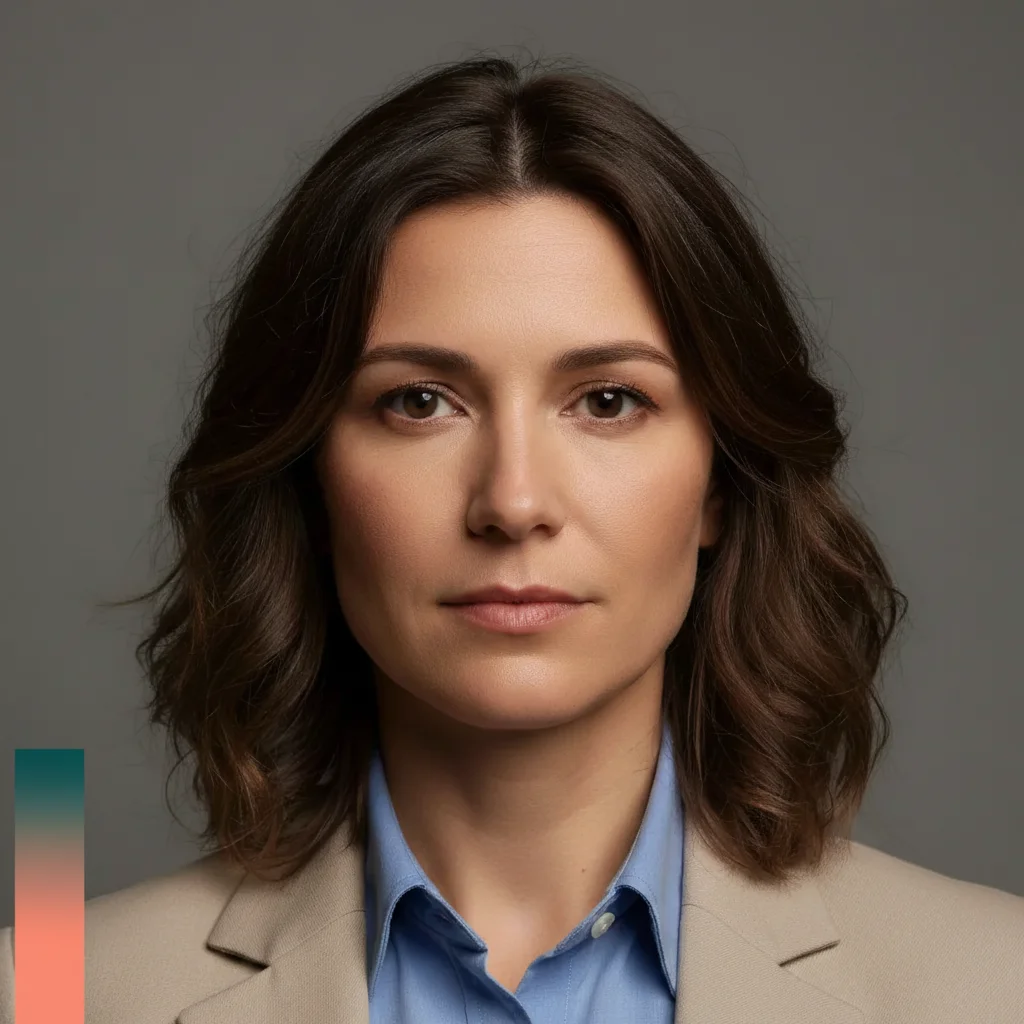
Use the classic teal and coral combo: 'apply duotone effect with deep teal for shadows and bright coral for highlights.' This is the signature Spotify album art look. Works best on portraits and close-up shots with good contrast.

What's the difference between duotone and a color filter?

Duotone replaces all colors with just two: one mapped to shadows, one to highlights. A filter tints the image but keeps underlying colors. Duotone creates the graphic, poster-like effect seen in album covers and concert posters.

Can I use more than two colors?

Duotone by definition uses two tones. For three or more colors, try 'apply tritone effect' or 'create gradient map with [color1], [color2], [color3] from shadows to highlights.' But classic duotone's impact comes from limiting to just two contrasting colors.

Which color pairs work best for duotone?

Complementary colors (opposite on the color wheel) create the most striking duotone: blue/orange, purple/yellow, red/cyan, green/magenta. For subtle results, use analogous colors like navy/sky blue or burgundy/pink.

Is EditThisPic's AI duotone applyer really free?

Yes β€” you get 1 free edit per week, no account needed. For unlimited edits, plans start at $3.99/month.

Can I apply duotone on my phone?

Yes. EditThisPic works in any mobile browser β€” iPhone, Android, tablet. No app download needed.

What photo formats does the AI duotone applyer support?

JPG, PNG, WebP, and HEIC. Upload any common photo format and EditThisPic handles the rest.

Ready to create duotone art?

Free to try. No signup required.