
Pricing Open Editor

Turn a Photo into Art

Five ways to turn a photo into art, arranged by how much of the original photo survives — from a full-color oil painting that keeps the whole scene down to a single logo mark. Start wherever your photo belongs. One free edit every week, no signup.

Free to useNo signup requiredNo watermark

Drop your photo here

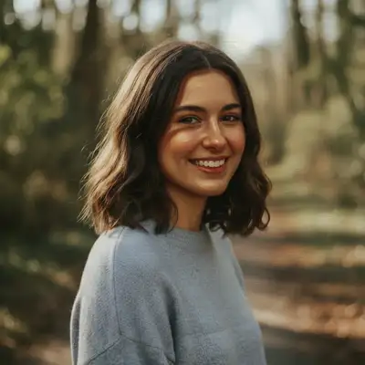
"Transform this portrait into a classical oil painting with rich skin tones, dramatic chiaroscuro lighting, and visible canvas texture"

Free to try · no sign-up · photos are never shared

Release to upload

Free • No signup

Before photo
Before
After AI edit
After
Quick Answer

To turn a photo into art, choose the style by how much of the original photo you want to keep. An oil painting keeps the full scene and color and lays brushwork over it; an impressionist pass trades sharp detail for light and loose strokes; a charcoal drawing drops color and lets tone carry the image; line art keeps only the outlines; a logo reduces the subject to one simple mark. Upload your photo on any of these pages, describe the look in plain language, and you see the result before you decide anything — the first edit is free, one free edit every week, no signup.

Why This Order — Each Step Removes Something

The five tools on this page are not five flavors of the same thing. They form a ladder, and each rung throws away one more layer of the original photograph. Oil painting keeps everything and adds. Turning a photo into an oil painting preserves the color, the composition, and the tonal range of your original, then lays brushwork and canvas texture on top. It is the most forgiving rung because the photograph is still doing most of the work. Impressionist keeps the color but gives up the edges. Impressionist style trades precise detail for light — dappled sun, broken color, visible strokes. Faces get softer here, which is why it flatters landscapes and gardens more than it flatters portraits. Charcoal gives up color and keeps tone. A charcoal drawing has only light and dark to describe a face or a form, so it rewards photos with strong directional lighting and punishes flat, evenly lit ones. Line art gives up tone and keeps only shape. Line art has line weight and nothing else, which is why a cluttered background that was merely busy in a painting becomes unreadable here. A logo gives up the scene entirely. Photo to logo keeps one silhouette and one idea, tested at the size of an app icon. The practical rule: work down the ladder, never up. Each rung discards information, and the next tool can only work with what reaches it. A line drawing cannot be turned back into a convincing oil painting, because the color and tone it needed are already gone. If you are unsure, start high — an oil or impressionist pass — and step down only if the result feels too photographic.

Fix the Photo First, Then Style It

An artistic pass does not repair a photo. It reinterprets whatever it is given, which means softness, color casts, grain, and damage all get faithfully translated into brushstrokes — and once they are brushstrokes, they are indistinguishable from intentional texture and can no longer be corrected. So the sequence matters. If your source is a phone photo that came out flat or soft, run a quality pass through the photo enhancement tools first, and only then bring the cleaned version here. If your source is a scanned print with fading or scratches, restore it first — an oil painting made from a scratched scan will have the scratches painted in. The same goes for cropping. Decide the frame before you style, not after: line art and logo conversions in particular are sensitive to how much background is in shot, and cropping a finished line drawing leaves you with an awkwardly weighted composition rather than a tighter one. One exception worth knowing: you do not need to upscale before styling. If you want a large print, say so in the prompt instead — asking for output 'suitable for a large canvas print, high detail' gets you a result built for that size, and you can always enlarge the finished artwork afterwards. Every step of this is visible to you as you go. You see each result before you decide anything, so a wrong turn costs a description and nothing else.

Use case guides

Wall Art From a Photo You Already Have

The most common reason to turn a photo into art is to hang it. A framed print asks more of the image than a screen does: it is looked at from a few feet away, in daylight, for years. That pushes you toward the top of the ladder — oil and charcoal hold up at print size because they keep texture, and texture is what stops a large print looking like a stretched photograph.

Common scenarios

  • A favorite pet photo turned into a classical oil painting for above the fireplace
  • A wedding or anniversary portrait rendered as a charcoal drawing for a monochrome frame
  • A holiday landscape reworked in impressionist style, where the light was the reason you took the shot

Best practices

  • Say what it is for: adding 'suitable for a large canvas print, high detail' to your prompt makes the AI prioritize a sharp, print-ready result over a screen-sized one.
  • Fix the photo before you style it — an artistic pass bakes in whatever softness or color cast was already there, so run a quality pass on the original first.
  • Pick one style and iterate on wording rather than jumping between styles; 'thick impasto brushstrokes' and 'smooth blended brushwork' are the same tool pointed in two directions.
  • Portraits need an anchor: add 'preserve the subject's likeness' so the style does not drift toward a generic face.

Sample prompts

Transform this portrait into a classical oil painting with rich skin tones, dramatic chiaroscuro lighting, and visible canvas textureConvert to charcoal drawing at high quality suitable for a large canvas print, with deep blacks, bright highlights, and visible paper grain

Matching the Style to What the Photo Actually Has

Every style on this page throws something away. Impressionism throws away edges, charcoal throws away color, line art throws away tone. The style works when the photo's strength is in what survives — and disappoints when its strength is in what got discarded. A backlit garden becomes a beautiful impressionist painting and a poor line drawing; a graphic silhouette becomes striking line art and a muddy impressionist one.

Common scenarios

  • A photo whose subject is light and atmosphere — water, leaves, low sun — going to impressionist rather than line art
  • A photo whose subject is shape and outline — a building, a bike, a profile — going to line art or a logo mark
  • A photo whose subject is a face and its expression — going to oil or charcoal, both of which keep tonal modeling

Best practices

  • Ask what the photo would lose: if you cannot describe the picture without mentioning its colors, do not choose a monochrome style.
  • Name the medium, not the mood — 'oil on canvas with visible impasto strokes' produces a different and more predictable result than 'painterly'.
  • Busy backgrounds survive painting styles but wreck line art; crop tight before converting to outlines.
  • For anything heading toward a mark or icon, say how simple: 'two colors, bold uniform line weight, no text' is a brief, 'make a logo' is a wish.

Sample prompts

Transform this water scene into Impressionist style with broken color reflections, loose brushstrokes on the water, and shimmering light effectsConvert to clean line art with bold black outlines and minimal detail, tight crop on the subject

Trying Several Styles on the Same Photo

Most people do not know which style they want until they see two of them side by side. That is a legitimate way to work here: each page takes the same upload, and you see each result before you decide anything, so comparing an oil version against a charcoal one costs you nothing but the time to describe both.

Common scenarios

  • Deciding between a color painting and a monochrome drawing for a gift, by generating both
  • Testing whether a product photo reads better as line art or as a simplified logo mark
  • Working down the ladder — oil, then charcoal, then line art — until the image stops improving

Best practices

  • Keep the same source file for every attempt; comparing a styled version against a re-styled version of a styled version tells you nothing.
  • Change one word at a time between runs — 'loose' to 'tight', 'vintage' to 'modern' — so you learn which word did the work.
  • Work down the ladder, not up: styling an already-styled image compounds the abstraction and rarely recovers detail.
  • Save the wording that worked. The prompt is the reusable part, not the output.

Sample prompts

Convert into a modern oil painting with bold expressive brushwork, saturated colors, and abstract backgroundTransform into loose charcoal sketch with expressive strokes and minimal detail

Example prompts to get started

Transform this portrait into a classical oil painting with rich skin tones, dramatic chiaroscuro lighting, and visible canvas texture
Convert into an oil painting with thick impasto brushstrokes, vibrant color mixing, and visible palette knife texture
Transform this into French Impressionist painting style with loose visible brushstrokes and vibrant dappled sunlight
Convert to charcoal drawing with deep blacks, bright highlights, and strong contrast
Convert to clean line art with bold black outlines and minimal detail
Convert this into a simple logo mark — bold uniform line weight, two colors, plain background, no text

Frequently Asked Questions

Which art style keeps the most of the original photo?

An oil painting keeps the most. It preserves the color, composition, and tonal range of your original and adds brushwork and canvas texture on top, so the photograph is still doing most of the work. From there each style discards one more layer: impressionist gives up sharp edges in favour of light, charcoal gives up color in favour of tone, line art keeps only outlines, and a logo mark keeps only a silhouette. If you want the result to still read clearly as your photo, start with oil.

Can I turn a photo into an oil painting or drawing for free?

Yes. Upload your photo, describe the style you want in plain language, and you get one free edit every week with no signup and no watermark on the result. Every style on this page — oil painting, impressionist, charcoal, line art, and logo — runs through the same free-first flow, and you see the result before you decide anything. If you want to try several styles on the same photo in one sitting, credit packs are available without a subscription.

Should I improve a photo's quality before turning it into art?

Yes, and in that order. An artistic pass reinterprets whatever it is given rather than repairing it, so softness, color casts, and grain get translated into brushstrokes — and once they are brushstrokes they look like intentional texture and can no longer be corrected. Run a quality pass on the original first, crop it the way you want it framed, and then convert it to art. The one thing you can skip is upscaling: ask for output suitable for a large canvas print in the prompt instead.

What is the difference between line art and a charcoal drawing?

A charcoal drawing has tone: it uses shades of grey, smudged shading, and deep blacks to describe form, so faces and folds still have volume. Line art has no tone at all — only outlines and line weight — which makes it flat by design and ideal for coloring pages, prints, tattoo references, and cut files. Charcoal suits photos with strong directional lighting; line art suits photos with clear shapes and an uncluttered background.

Will an art style still look like the person in the photo?

Usually, but it depends on the style and on how you ask. Oil and charcoal keep tonal modeling, so they hold a likeness well. Impressionist and heavily abstract styles deliberately soften facial detail and can drift toward a generic face. The fix is to say so: adding 'preserve the subject's likeness' anchors the result, and a well-lit, front-facing source photo gives the AI more to hold onto than a small or backlit one. You see the result before you decide anything, so you can reword and rerun if the likeness slipped.

Can I print or commercially use the artwork made from my own photo?

The results are yours to use, and they download without a watermark, so printing a canvas, a card, or a framed gift from your own photo is a normal use of these tools. Treat a logo conversion slightly differently: what you get is a raster concept, excellent for testing whether an idea works at small sizes, but a designer will still need to redraw it as vector artwork before it goes on signage or packaging. Make sure you have the right to use the source photograph in the first place.

Ready to start editing?

Open Editor