AI Color Grading Tool
Free AI Color Grading Tool
Drop your photo here
or click to browse
Release to upload
Free • No signup
Popular use cases:
- color grading
- cinematic color grading
- teal and orange
- film color grading
- movie color grade
- LUT alternative
- color grade photos
- cinematic look
- blockbuster color grade
- indie film color
- mood color grading
- Cost
- Free No signup required
- Time
- Instant results in 15-30 seconds
- Works on
- Any device - browser, phone, tablet, desktop
- Powered by
- AI-powered photo editing
| Scenario | Prompt | Time |
|---|---|---|
|
15-30s | |
|
15-30s | |
|
15-30s | |
|
15-30s | |
|
15-30s | |
|
15-30s |
How it works
Try it free ↓
Free AI Color Grading Tool
Drop your photo here
or click to browse
Release to upload
Free • No signup
See it in action
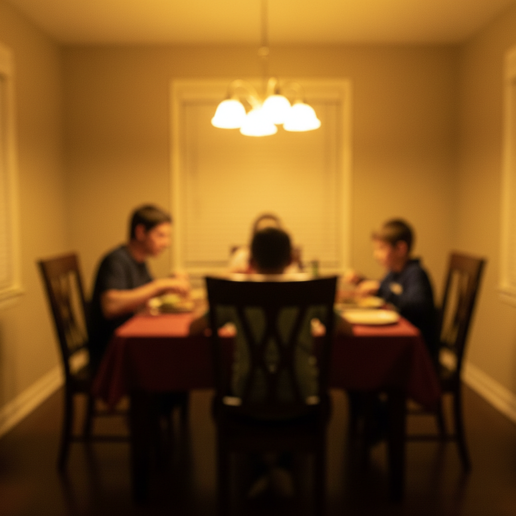
Prompt:
Apply teal and orange color grade - push blues and shadows to teal, shift yellows and highlights to warm orange


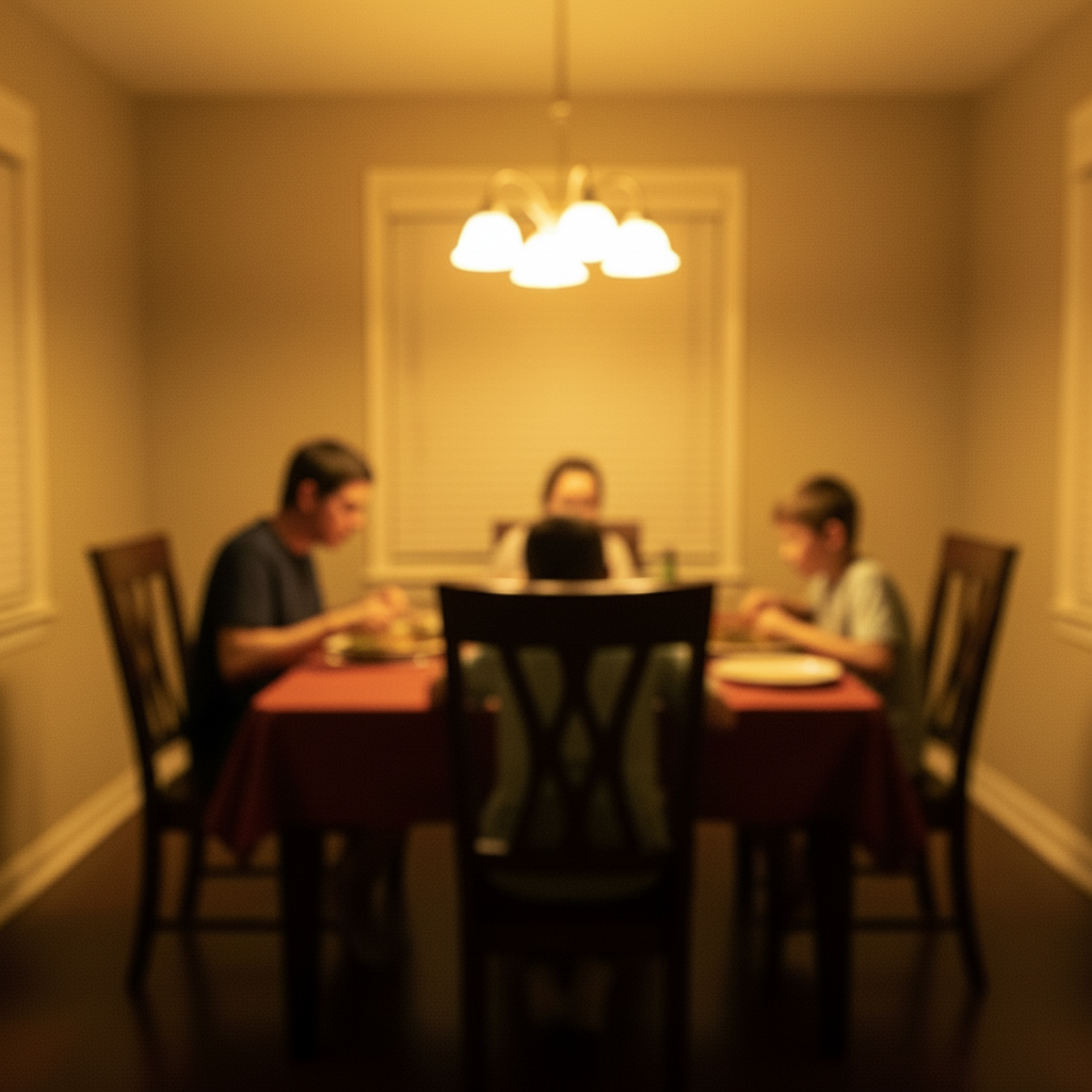
Prompt:
Create desaturated indie film look with slightly lifted blacks and muted colors except skin tones


Prompt:
Give it cold blue thriller grade - push everything toward blue and teal, desaturated, moody shadows
If something looks off
Quick answers
Ready to apply cinematic color grading?
Free to try. No signup required.